01
Concept & Art Direction
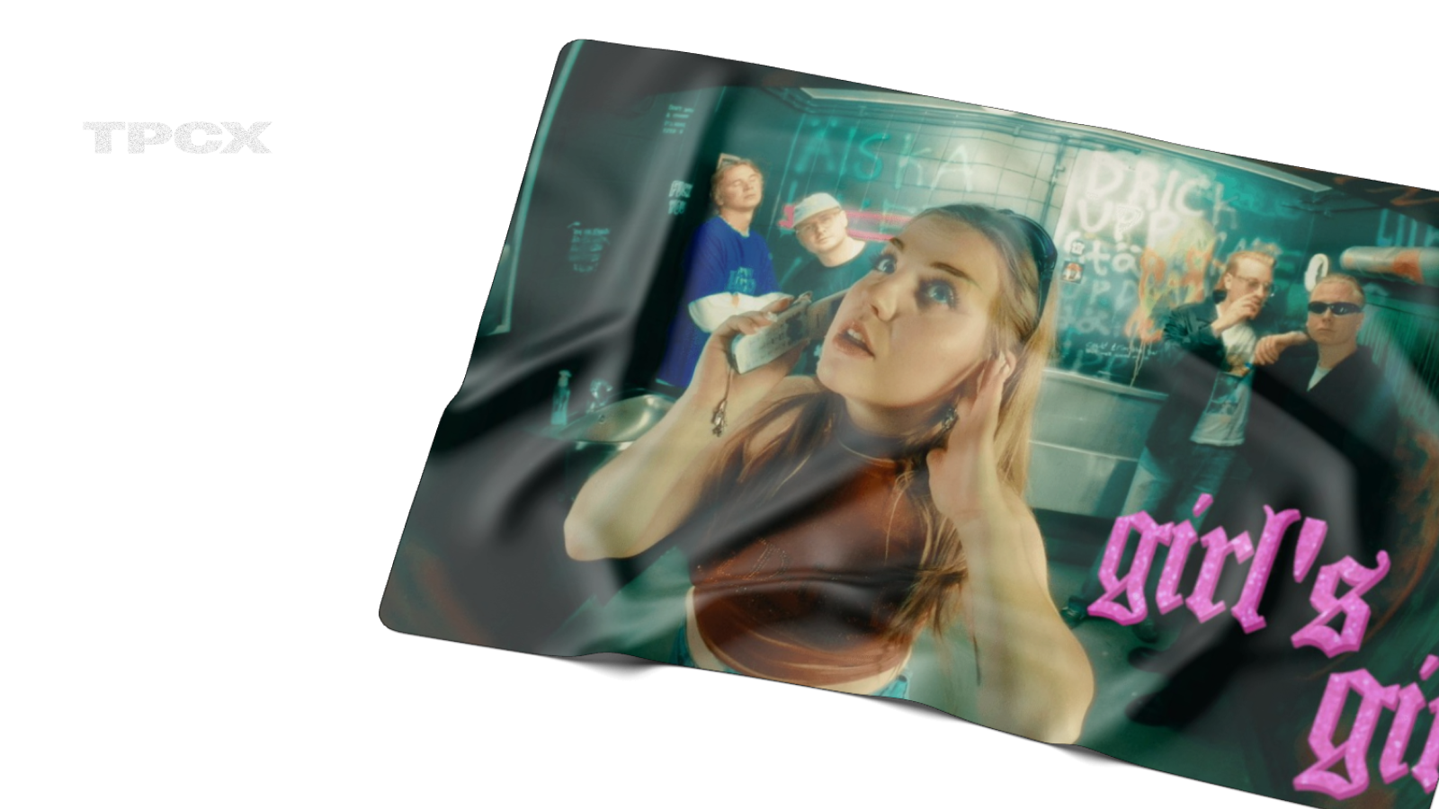
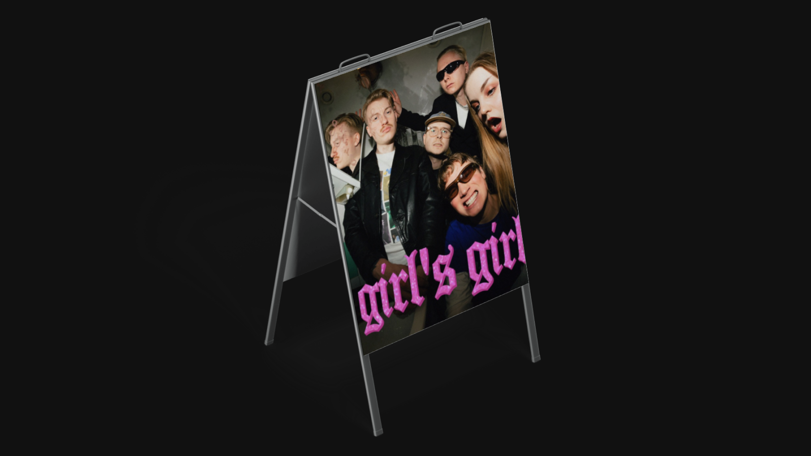
Developed the creative direction around the band's identity - fisheye lens aesthetics, underground graffiti spaces, cold teal lighting. The concept: the band IS the design. No UI chrome, no sections, just presence.
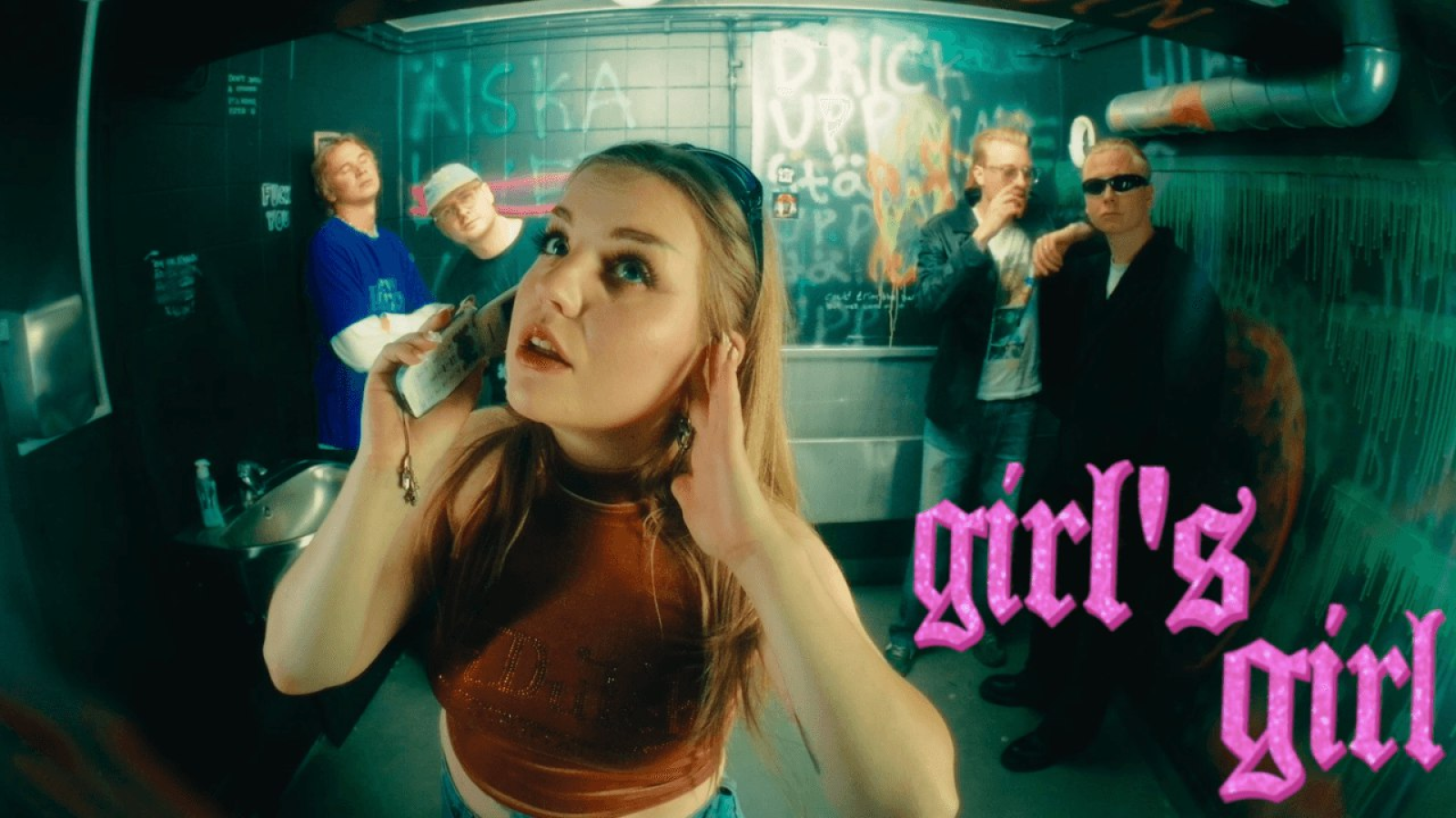
No template, no grid - a band site that feels like their music.
(01) Overview
TPCX is a Gothenburg-based rock/indie band with a raw, underground aesthetic. They needed a website that felt like an extension of their music - no templates, no conventional layouts, just pure atmosphere and direct links to where fans can listen and connect.
Key result
Mobile-first
atmospheric, unconventional layout that stays fast and readable on phones
(02) Scope
(03) Process
Developed the creative direction around the band's identity - fisheye lens aesthetics, underground graffiti spaces, cold teal lighting. The concept: the band IS the design. No UI chrome, no sections, just presence.
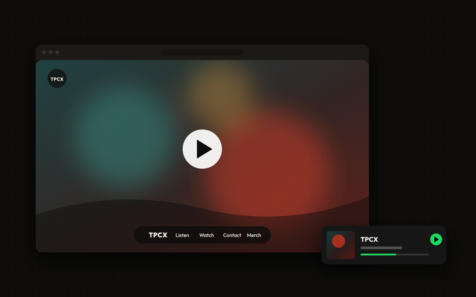
Built the entire site in Framer as a full-viewport video experience. The music video plays on loop, with overlaid floating nav links, a 'Now Streaming' pill, and social icons. Maximum impact, minimum UI.
More from the project
(04) Results
1
page, full impact
4
nav links only
Zero
conventional layouts
Next project
HUG.ngo →
Large-scale NGO redesign - UX, filters & donation optimization